Friday, July 22, 2016

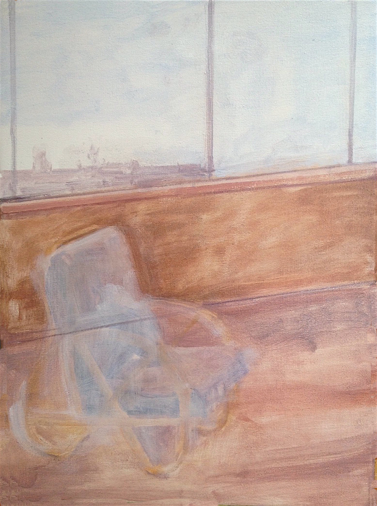
The Art of Illusion


oil on wood, 50 x 50 cm


The art of illusionistic painting, otherwise known as trompe l'oeil (trick the eye), has a long history. There are a number of paintings by artists throughout the centuries depicting the rear of a canvas and this is one of four versions I've painted, but the only one I've done on wood. 

I've always found it a magical experience when tubes of sticky coloured substances called paints seem to be transformed into other materials or textures. An achievement realised through feel rather than skill and observation.

Saturday, July 16, 2016

Drawing Peter Wegner

Peter Wegner and I were judges at the Great Southern Portrait Prize in 2015 and it was on this occasion that we decided to draw each other. After about a year and a half, the right time presented itself and Peter came to my place for a sitting.

It was another standing pose, done with charcoal and white pastel. It took nearly three hours with a few short breaks along the way. I'll be awaiting my turn to pose for Peter of which I'm looking forward to.

Peter won the Rick Amor Drawing Prize a few days prior to our sitting so it has been a drawing feast for both of us.


Tuesday, July 12, 2016

Drawing Kate

I've always loved the profile portraits of Tom Roberts, and of course, those portraits from the Renaissance, so recently I asked Kate Nodrum to pose in profile. She stood for over two hours without a real break, which is a difficult thing to do. I thought sitting in a chair might cause a slight slump in posture which might subtly effect the pose I was after - a sitter who is alert and could move away at any moment.


Portrait of Kate Nodrum, 2016, charcoal and white pastel, 38 x 27 cm


Thursday, July 7, 2016

Clouds Passing the Moon


The lower photograph was taken by Deborah Klein earlier this year when I was painting the moon from our balcony in Abbotsford. I wanted a more complicated composition, more than a quick sketch might achieve where there isn't enough time to think about structure. 

When painting clouds crossing the moon, time is a consideration. Clouds change so quickly that trying to capture something of the night moments is almost a race before too much change takes place in the sky. 

One often hears it said that artists capture a fleeting moment in time but that is not literally true. To capture a moment in time, time would have to stand still so it can be captured. Working from life is about constructing a picture that reflects what it was like being there for those short moments or even hours, but in a way that looks like time did stand still. Memory and feeling come into play to conjure a picture that seemingly is a fleeting moment.

Matisse pointed out the difference between a sketch and a more considered work, when he said that a sketch has freshness while a more considered image has a greater sense of structure. 

Although this painting from my balcony started from life, I added to it in the studio as well, trying not to paint over the initial sketch too much, exploring the possibility of making a painting that has both freshness and structure. 


Clouds Passing the Moon, 2016, oil on MDF, 40.5 x 50.75 cm


Friday, July 1, 2016

Some More Calligraphy

 As I mentioned on a previous post, I did a short calligraphy course in the late '80s. Here are a few more works I composed around that time.

The top one measures 56.25 x 41.75 cm. The lower one measures 62.5 x 50.75 cm. Watercolour and ink.


Tuesday, June 21, 2016

Space and Light


I've always loved paintings of interiors, not so much for what's in them, but more as a space and a light within which things take their place. Light and space transcend the material, or perhaps it's better to say that they add eternity to the physical because each exists at the same time.

Avigdor Arikha (1929-2010), Vilhelm Hammershoi (1864-1916), Gwen John (1876-1939) and Edward Hopper (1882-1967) are artists whom I admire for the way they sometimes interpreted an interior. An enclosure was transformed into a means where space and light were more important than what was in the room.

The images below show the changes that took place during the painting process - a chair has been eliminated, and the angle of the light coming from a doorway was changed. 

Although the painting was done from life, it's a different image to how it was in actual life. The photograph of the sunroom corresponds to the empty interior in the painting. The photograph from the backyard of the distant view towards the city of Ballarat became the view from the window in the painting; essentially making the work the adoption of two different views to arrive at a final version that looks like a single viewpoint from a light filled room. 


Space and Light, 2016, oil on canvas


Sunroom, transferred into an empty space.

Distant view becomes view from the window in the painting.

Monday, June 13, 2016

The Light of the Moon


These two paintings were based on sketches and from a memory of a time the moon was full. Driving back to Melbourne from Ballarat at night can be a magical experience. There is a road trailing down the Pentland Hills and around one of the bends the city lights suddenly appear like a string of glistening jewels laid across the horizon. On one particular occasion the moon sat in the sky with the clouds hanging above it, just like in the painting. The clouds were much whiter that night, but I made them darker because I felt it showed the glow of the moon better. I was also intrigued by the way the light of nature hovered over the light created by human beings, and yet, it's the same light.

The lower painting was turned into a vertical version of a squarer oil sketch. The sketch appears in a previous blog post titled Sketching the Moon (the top image).

These larger works are done by painting the moon and sky first, allowing the surfaces to dry and then adding the clouds later. They are painted with primary colours and white but without the addition of black.


 City Lights and the Moon, 2016, oil on canvas, 76.5 x 92 cm


Full Moon, 2016, oil on canvas, 91.5 x 61 cm

Thursday, June 9, 2016

Sketching the Moon

I've been continuing my interest in sketching the moon so here are two more examples. Each painting measures 27.5 x 28.5 cm. They were both painted in a few hours, which was my aim - to capture something of the night the moon shone amongst the clouds. Having said that, I divided the time it took into two sessions. Firstly I sketched the sky and moon, waited for it to dry, and then waited for another full moon and added the clouds. These sketch pictures are mainly inventions because the speed at which clouds change shape makes it impossible to follow their form, so in a way, they can't be painted from life. But just looking into the sky helps to make an image that has something of nature in it.

I've also been painting pictures of the moon on a larger scale and when I do I often have these sketch pictures at hand as a guide to recall the feeling of the night. The memory of what I saw can be a starting point for these larger works but that is different from trying to remember exactly how the scene looked.


Wednesday, June 8, 2016

Arthur Streeton at Geelong Gallery

Recently I saw an exhibition of the paintings of Arthur Streeton at Geelong Gallery. The exhibition was titled Land of the Golden Fleece - Arthur Streeton in the Western District. The focus was on the landscape paintings Streeton completed in the Western District between 1920 - 32.

Whenever anything is written about Streeton, the assumption is always made that he never reached the heights of his youth, just before he went to England. There are many paintings Streeton did that, although very good, did't attain the magic of his youthful works, but this exhibition cast this assumption into myth. Many of the works have never been seen publicly because they are in private collections, avoiding the gaze of a critical eye.

I have always believed in this myth until I saw the exhibition at Geelong. It was a surprise to me to see such quality, some of them quite breathtaking. Streeton had a sweeping vision and his ability to take one's eye into the infinite is truly amazing. His colour has such richness and warmth and his brushwork was searching and confident instead of settling for superficial bravura. He could capture the air, the smell, the heat and the light of the open spaces of Australia, qualities that cannot be copied but only felt.

Full marks for Geelong Gallery for presenting such a great exhibition from one of the world's great landscape painters.


 The Grampians (Mount Abrupt), 1921, oil on canvas, 51.6 x 76.7cm


 Cliff and Ocean Blue, 1932, oil on canvas, 63.5 x 76cm


Mount Rosea, Grampians, 1920, oil on canvas, 63.5 x 76cm

Friday, May 13, 2016

Towards the Light

Towards the Light - portrait of Ade Hatfield, 
2005, dry pastel,

This portrait pastel drawing was done from an oil painting I did over thirty years ago, mainly because I thought I could redo it better. Generally artists paint from drawings but there are no rules, so whatever suits one's practice is the only imperative. It's rare for me to make an image from another image I've already done, but occasionally I try it out. I changed the dress from yellow to green and introduced a dark back ground. I use more colours in my pastel drawing than I do with my oil painting and apply them with a slightly looser technique.

I found the light reflections on the glasses an interesting accident because I didn't plan the portrait to be that way. But it reminded me of a person who enters the latter part of their life which proposes the question, what comes after when our years have been lived? The title of the drawing Towards the Light suggests there may be more but the fact remains we don't know. 


Wednesday, May 4, 2016

Arrangement in Grey and Black No. 1

Arrangement in Grey and Black No. 1, 1871, oil on canvas, 366.5 x 412.8 cm

The National Gallery of Victoria has a small exhibition of the work of James McNeil Whistler, and the main attraction is the famous painting of his mother titled Arrangement in Grey and Black No. 1

This is the only Whistler painting in the exhibition but there are a number of his etchings on display and they are magnificent. There are also some paintings by Australian artists who were Whistler's contemporaries, pointing to the fact that his thoughts on art had an undoubted influence on their work.

But the famous painting of his mother is a wonderful achievement. It would have to be one of the most elegant and subtle paintings an artist could create. On close inspection, it reminds me of what the Australian painter Hugh Ramsay said on viewing it, that it seemed 'as if it was thought onto the canvas rather than painted', and it's an excellent observation.

It does look as if it was breathed onto the canvas. The thinness of paint and the way it's applied, like interwoven veils, gives the impression coloured clouds gathered to form an image. But it has structure, which saves the painting from being too ephemeral or lacking a core that grounds it to our world as well.

Whistler was an artist whose character was not transferred to his art. He was a prickly human being who painted the most restrained and serene works. He was very attached to his mother, so this could be a reason he rose to the occasion and painted a portrait that is undoubtedly one of his greatest masterpieces.

Saturday, April 23, 2016

En Plein Air at the Track

After Dawn at the Track, 2015, oil on linen, 46 x 61.5 cm

My last exhibition had horse racing as its theme and I've continued with this subject matter from time to time. This painting was done on the spot in the early morning at the Caulfield racecourse in Melbourne when the sun had just arisen. As I've mentioned on previous posts, I love outdoor paintings, and the work of artists from the latter half of the 19th Century is one of my favourite periods of Art History.

The horses were based on some quick oil sketches and observation during track work, so they're a mixture of looking and invention, as all my work is. The horses on the right were based on the left-hand horse in the sketches, reflected in a mirror to reverse their positions. I rarely work from sketches because when an artist paints or draws from life, what is before one's eyes is a readymade sketchbook, and it's up to the artist to change and edit the subject matter as the work unfolds.


Oil Sketches during track work, oil on MDF, 18.25 x 36.75 cm

Wednesday, April 20, 2016

Grayson Perry at the MCA Sydney

Last Sunday Deborah Klein, Paul Compton and I flew to Sydney to view the Grayson Perry exhibition at the Museum of Contemporary Art called My Pretty Little Art Career.


Shane Jones, Deborah Klein and Paul Compton 


It was an amazing collection of artworks, including sketchbooks, prints, pottery, sculpture and tapestries. There were three video interviews with Perry, and what comes across is his intelligence and warmth for human beings. As he says, his cross-dressing has given him a tolerance for people and their differences and this comes out in is art.

His imagery is loaded with visual and textual information but it doesn't overwhelm the brain and eye. Instead, it engages one's curiosity, proven by seeing the many onlookers bending forward, deeply interested in what was in front of them. You could spend many hours scrutinising just one work.

His use of words enhances the atmosphere of his imagery, a rare achievement, since text is often used to explain the subject or enhance poor drawing. Perry's text brings forth a sense of the nostalgic and the contemporary at the same time. Using well known commodity brand names, puns, historical references or describing satirical situations, he creates an environment that's easy to enter. He also has a sense of the Medieval and the Renaissance which influences some of his floral patterns and pseudo-animal images.

Perry loves to transform traditional materials into art, and there's a fast motion video called Time Lapse, 2003, which shows him creating one of his pots from scratch to the finished state.

He also talks about his many influences inspired from his museum going, but this also reveals his interest in Art history. He is obviously an artist that sees himself as someone who wants to add a link to the chain of the art that has come before him, rather than someone who doesn't understand its relevance to an artist's development.

There were a number of large tapestries, designed by him in Photoshop but woven through a computer controlled loom program which allows for large tapestries to be made quickly. Although he always uses traditional materials and often traditional processes, the exception is the computer controlled weaving which is not the same as the hand woven, although the finished artwork is an impressive sight. On close inspection, there are a number of layers so I'm not sure just how they were made since a traditional tapestry has only one layer.

But Perry is a maker and a thinker, and his sketchbooks are fascinating as it allows one to look over his shoulder and watch his ideas take their first steps as art. He has a graphic art and design sensibility, and a lot of his work looks like large scale illustrations, but his drawing is a strength and along with his amazing compositions, these qualities have enabled Grayson Perry to make many memorable images.


Walthamstow tapestry, 2009, 3 x 5 metres, wool, cotton, polyester, silk


Lamentation ( from the series The Vanity of Small Differences) 2012,
2 x 4 metres,wool, cotton, polyester, silk

The Rosetta Vase, 2011, glazed ceramic

Tuesday, April 5, 2016

State Library of Victoria Acquisitions

The State Library of Victoria has recently acquired four of my racecourse paintings, which was quite a thrill, since it's one of the great cultural institutions in the country. It also means that eight of my paintings now have a home at the Library.

All the paintings were done on site, except the running rails, which were done in the studio. The Flemington Racecourse from the Old Grandstand took 39 sittings, and it's a view around the entire circumference of the course.

The Old Grandstand will be replaced in the near future, so the view in the painting will become an historical one. The open air condition of the grandstand will be changed to a glass enclosure, which will be a very different experience for members.

In case you might be curious, the horse statue in two of the images is the great mare Maybe Diva, the only horse to have won three Melbourne Cups.


 Flemington Racecourse from the old Grandstand, 2014, oil on linen, 213.5 x 81 cm


 Flemington Racecourse, 2012, oil on linen, 71.5 x 122.5 cm


 The Straight Six, 2011, oil on wood, 45 x 50 cm


Caulfield Racecourse, 2013, oil on linen, 71.5 x 91.5 cm

Friday, April 1, 2016

Tom Roberts at the NGA

Deborah and I spent our Easter weekend in Canberra to see the Tom Roberts exhibition at the National Gallery of Australia. Roberts is an artist whom I've admired all my life, and it was a privilege to see a retrospective of his work. I expected to see a good exhibition, but the quality of his achievements literally shone from the walls in a way that my expectations were exceeded.

Most of the works were beautifully lit. I saw details that had alluded my eyes for years, and the paint texture and colour subtleties revealed themselves in all their richness. Every painting reflected what could only be called a love for his materials, subject matter, and the process of making images in paint. This is often mistaken for skill, but heart alone produces the richness that is present in a Tom Roberts painting.

Not many artists introduce a style of painting into their country, but Roberts did just that. He lived at a time when Impressionism swept the world, and it was his destiny to bring its influence to Australia. The group of artists he worked with has been called the Heidelberg School, and they emphasised the practice of making pictures out of doors - en plain air, although their colours were closer to nature  than French Impressionism. The brushwork of the French artists was generally broader than their Australian counterparts, but I like the way Roberts and Streeton used detail in distances, which has the effect of taking one into the far spaces of their landscapes. I've also admired the way the Heidelberg School artists captured not only the light of the sun, but its heat, perhaps more so than artists from other countries. Whenever I'm driving into regional areas, I always think of Roberts and Arthur Streeton and the truth of the outdoors they captured in paint.

The philosophy of Impressionism claimed that the important thing was to complete paintings directly from life in the open air, but this didn't always happen. Impressionists sometimes painted their outdoor works partly in the studio, nevertheless, many works were completed out of doors. Artists from previous centuries painted en plain air, but these works were never considered complete in themselves. The atmosphere of the outdoors was an impressionist's principal concern and they adopted a technique and colour sensibility that could best realise this. It's these aspects that separates them from previous artists, rather than en plein air painting itself.

Roberts' subject matter is broad, so I thought I would show a few images from different genres he explored.

This great Australian artist's work can be seen by googling Tom Roberts paintings.


A Breakaway, 1891, oil on canvas, 137.3 x 167.8cm

Holliday Sketch at Coggee, 1888, oil on canvas,  40.3 x 55.9 cm

Miss Isobel McDonald, 1895oil on canvas, 46.5 x 41.8 cm

Still life with Pomegranates, 1883, oil on canvas, 31.1 x 64.3 cm